Project Objective
This case study will discuss the app Paws Up, the research conducted, the design process, and solutions. The goal of this project was to create an app where people can get someone to watch their dog and to create a social media app for people with pets to connect. Research on dark UX patterns, design psychology, and journey mapping was conducted, and user testing was done to get the final result. This project was completed over six weeks.
Research
Competitive Analysis
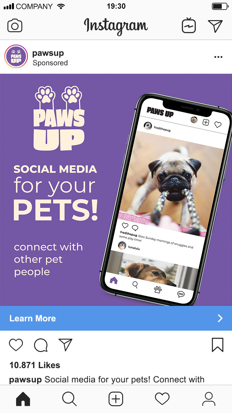
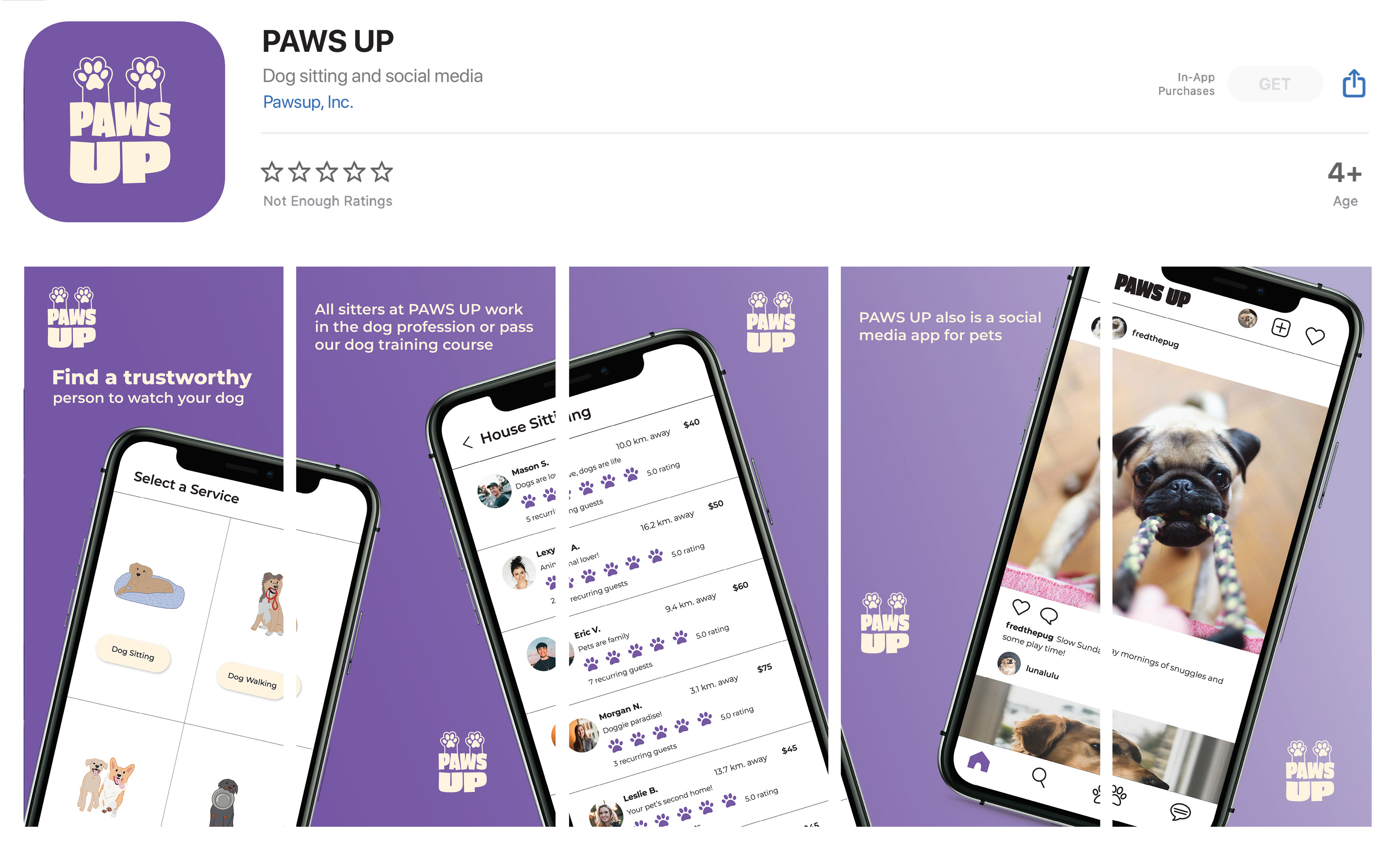
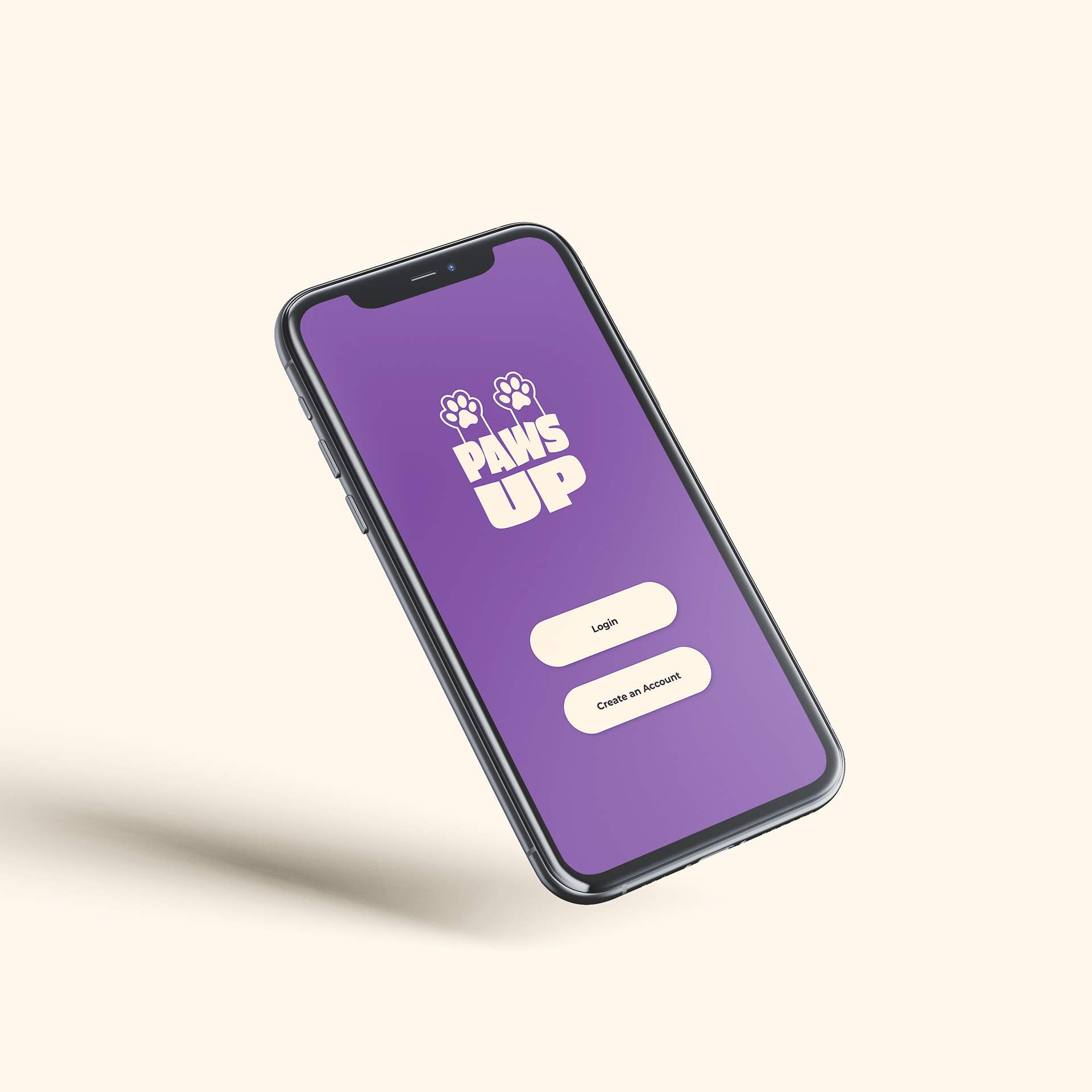
A competitive analysis was conducted to understand other dog service apps, the people who use their app, how their app works, and the pros and cons of the designs of the apps. Out of all the apps, Rover was the most popular and polished app. The Rover app had great filter options for creating a profile or searching for a sitter, so inspiration was used in the final app. The other apps were not as popular, so there were not many users on the apps. All competitors use green or blue for their app colours, which makes all their brands blend together. Purple was used to contrast with the competitors and to represent the luxuries of being a dog service app.
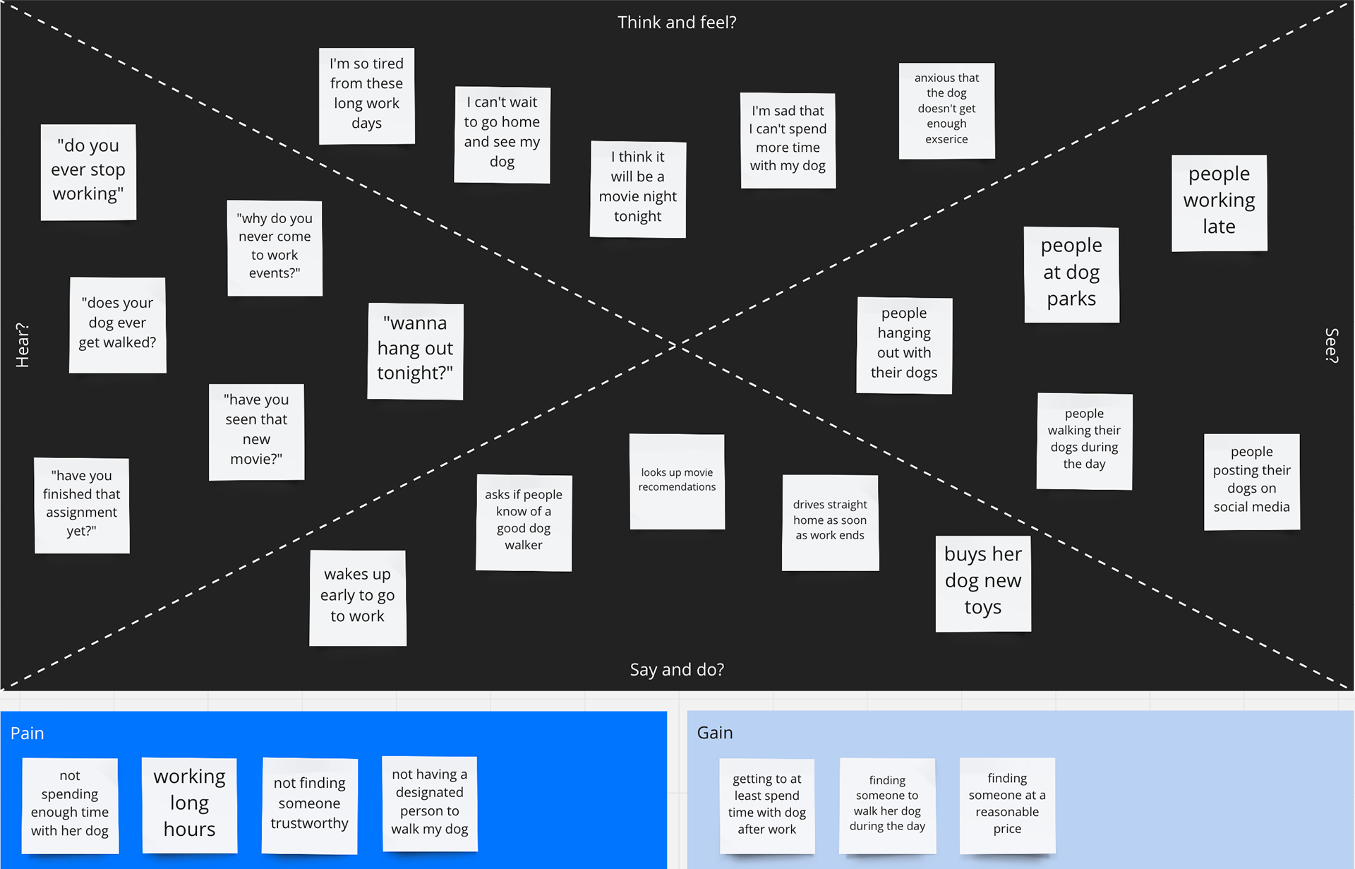
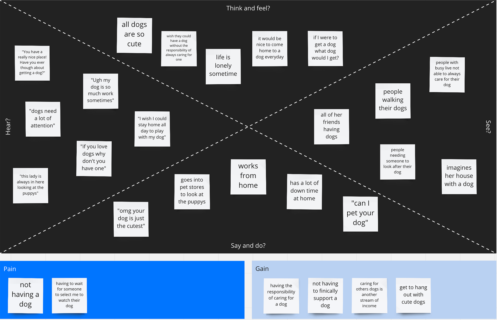
Empathy Mapping
Empathy Maps were done to understand the different target audiences and types of people using the app. Empathy maps helped to identify four main target audiences:
1. Dog owners who travel and need someone to watch their dogs.
2. People who want to watch dogs.
3. People who are busy during the day and need someone to feed and take their dog out during the day.
4. People who want to be active and sign up for dog walking.
Empathy mapping helped to understand what the users think, see, hear, and say.
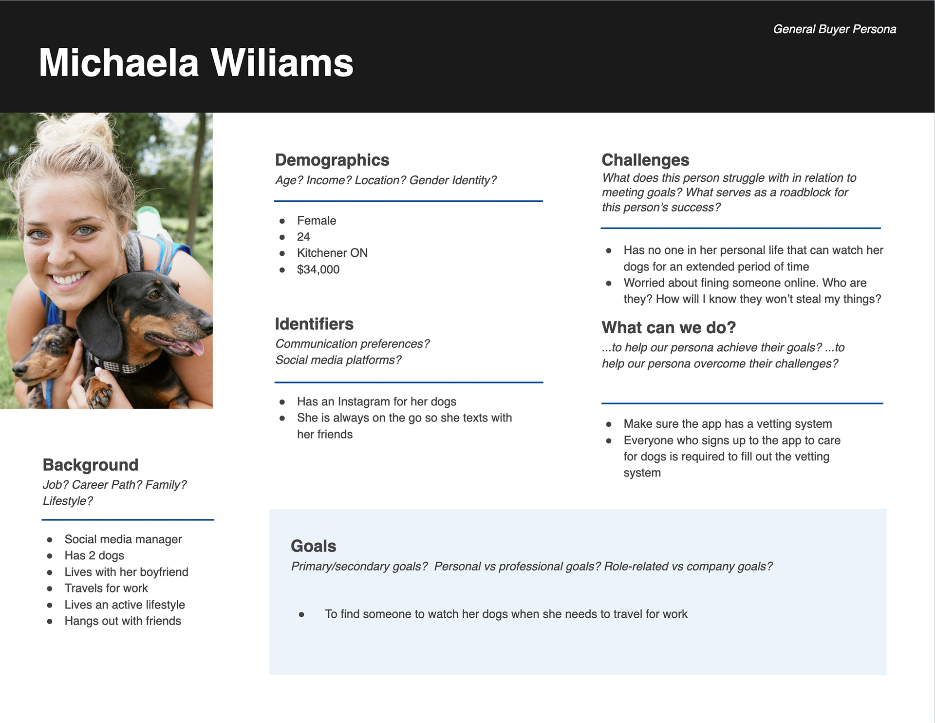
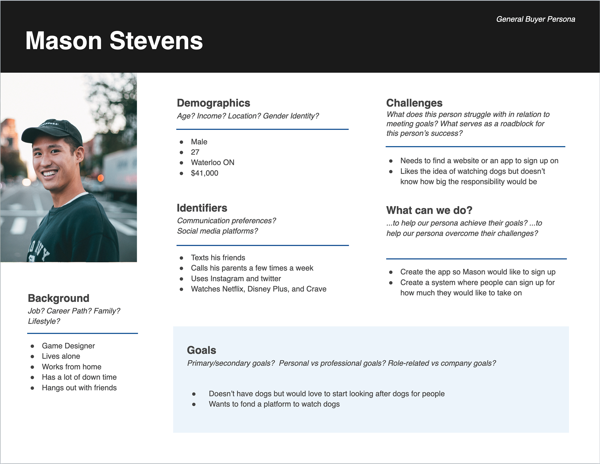
User Personas
Identifying the target audience through empathy mapping helped to develop user personas. The personas allow a visual to see what type of person would use this app, as well as their age, demographic, and background. A user persona was created for each target audience to identify what kind of people would use the app. Understanding the users in greater detail has helped to create better user flow in the app and influenced the design of the app.
Design Iterations & Process
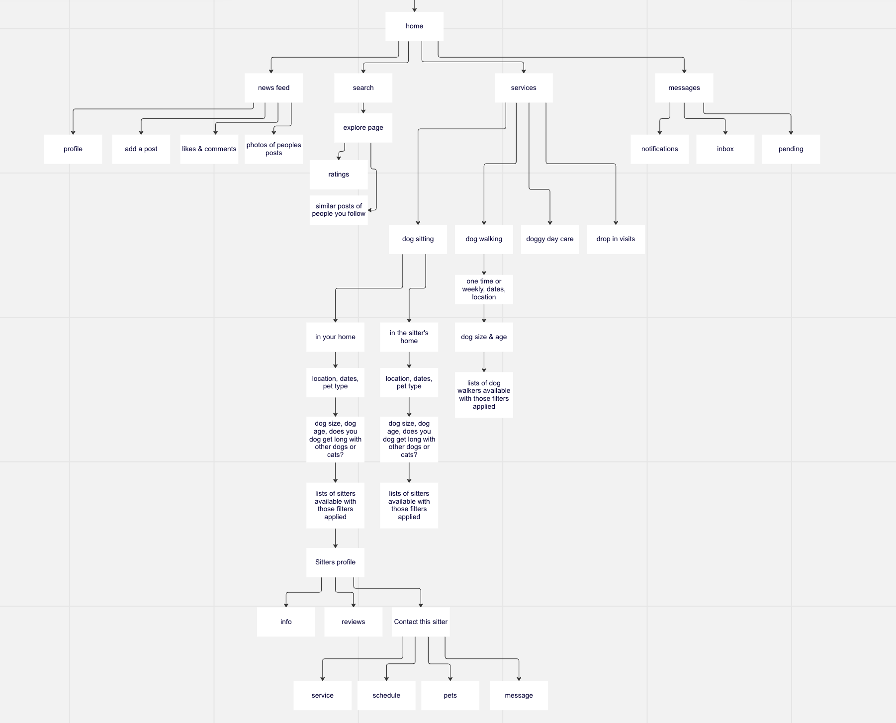
Site Map
Moving into the design process, a site map was made to organize all the pages in the app. A site map was a great tool to visualize all the different pages needed for the app and to see the user’s journey. This tool was also a way to ensure the navigation worked before designing each page, so if any changes needed to be made, it was easy to do so at this stage.
Wireframes
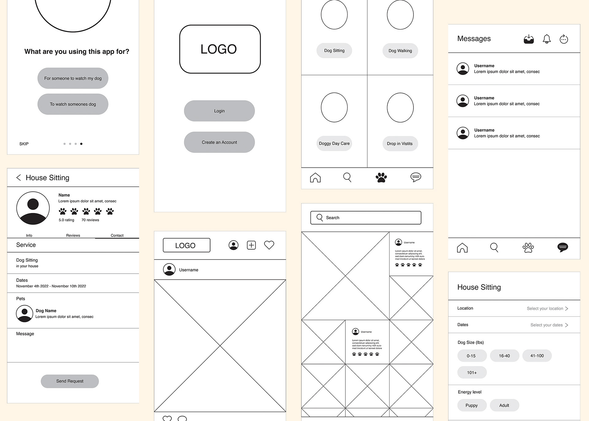
After creating the site map, wireframes were the next step. Starting with low-fidelity wireframes, they were quickly sketched out to get an idea of what the page would look like. For each page, a few low-fidelity wireframes were sketched to plan out all design possibilities. Each wireframe was reviewed, and one for each page was selected. Next, high-fidelity wireframes were created. These wireframes were created in Illustrator, designed in black and white, and are minimal. This was done to understand how the final screens would look and work out any technical issues during this stage.
User Testing
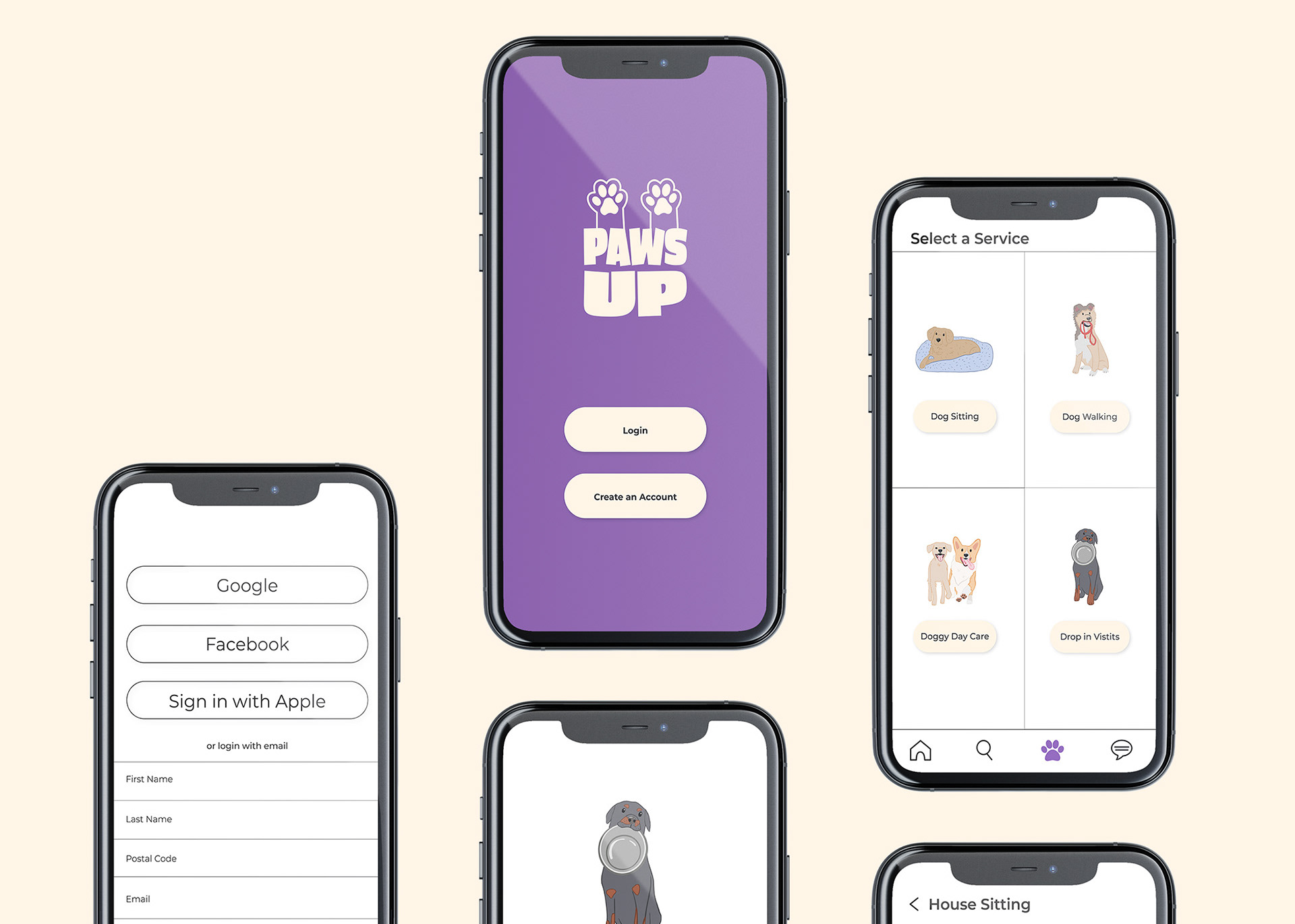
After completing the high-fidelity wireframes, a prototype was mocked up, and user testing was started. Five users were selected to test the app since this number will inform if any problems occur. From user testing, it was found that during the profile setup stage, users didn’t know the page was scrollable and would jump to the next screen. It was also recommended to have the completed profile show up after filling it out so the user can review it and make changes if needed. This was a crucial step in the designing process to see if other people would use the app as intended.
Iterations
After getting valuable feedback from the user testing, changes and adjustments were made to the wireframes. These changes were easy to apply since the design was still in the beginning stages. After these changes were made, they were tested on the same users to get their thoughts and opinions and to see if they could identify any other flaws in the design. After completing this, all users were good with the process, and no other flaws were discovered.
Results & Next Steps
Solution
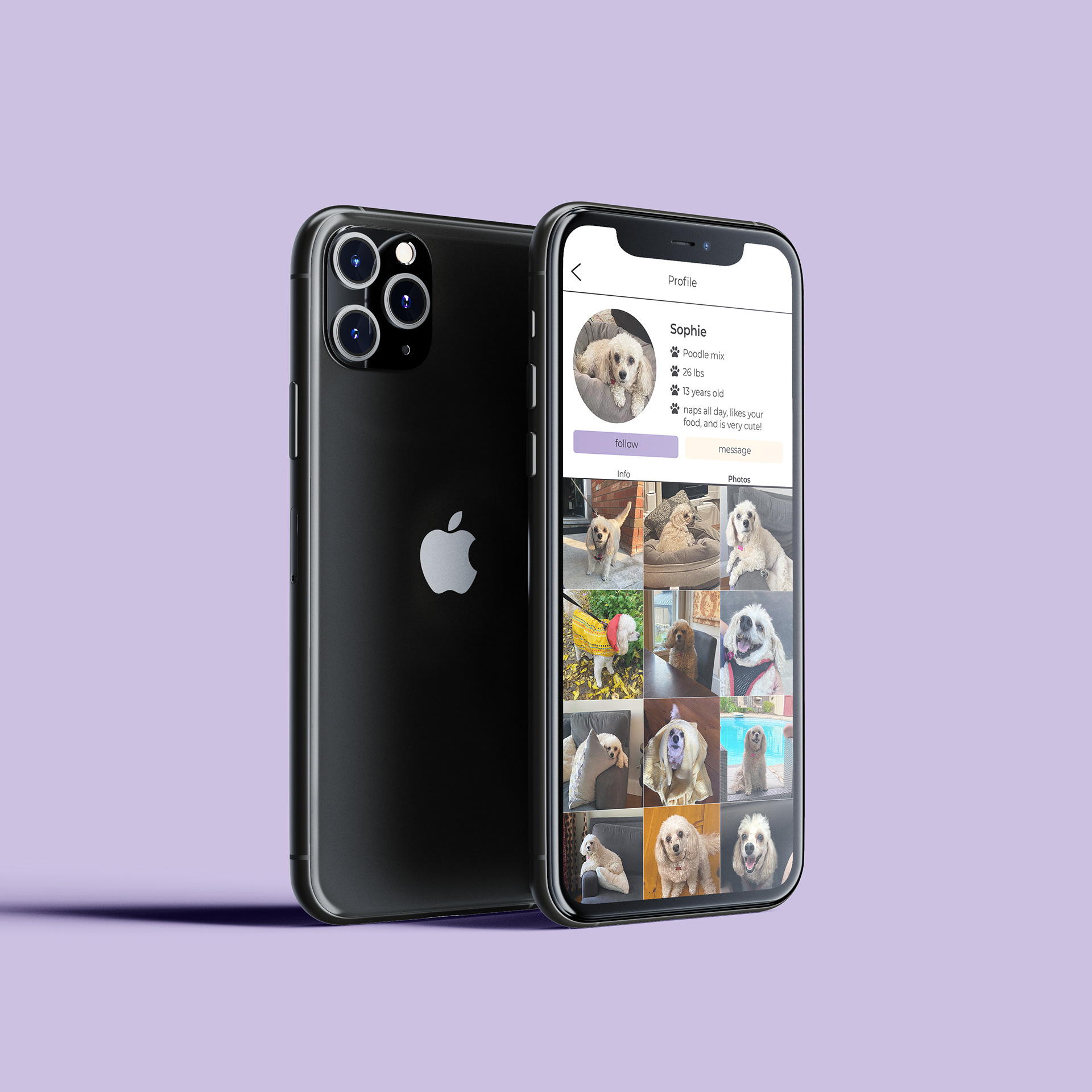
This solution was chosen because it aims to connect people and create new relationships. The final design is minimalistic and organizes the information into grids. Other solutions tested out the grid not being visible or having a more cluttered layout. But in the end, people responded more to the minimalistic grid layout.
Throughout creating this project, a lot was learned during this process, and the main takeaway is that a tremendous amount of work goes into creating an app. Another takeaway is that it is essential to do user testing to get a different perspective on the app and find any flaws that need to be worked out. Comparing and contrasting other apps similar to this one, it stands out from the rest with its social media aspect, colour palette, and purpose to connect people. Overall, the main goal of this app was to have a place where people can get someone to watch their dog when they cannot.
Advertisements